Simple Gradient Text CSS [Code Snippet]
![Simple Gradient Text CSS [Code Snippet]](/content/images/size/w1200/2022/05/graded.PNG)
I have been playing around with CSS gradients lately and discovered that you can use the gradient to mask text in a div and apply that effect to the text itself.
Here is a codepen of it in action and the code for this is below.
<div class="gradiant-container">
    <div class="gradiant-text">
      Lorem ipsum dolor sit amet, consectetur adipiscing elit. Proin vitae suscipit diam. Maecenas in ligula at tellus dictum maximus. Aenean lacinia dapibus felis, a convallis augue malesuada eu. Sed eget massa id nisl aliquet malesuada eget quis urna. Phasellus vehicula sodales sem imperdiet vulputate. Curabitur cursus lacus metus, vitae mollis diam gravida tempor. Aliquam ultrices felis ante, ac tempor justo feugiat eget. Vestibulum rutrum lectus eu dui vehicula, et volutpat sapien vestibulum. Nunc quis erat est. Phasellus sed odio at massa ultricies pulvinar sed ut odio. Etiam dignissim urna eget massa ornare cursus. Sed vitae mauris sit amet ante tempor volutpat ac et magna. Nunc luctus nec turpis sit amet posuere.
    </div>
</div>

<style>
.gradiant-container {
  background-color: black;
  padding: 25px;
  font-family: Arial;
  font-weight: bold;
  font-size: 25px;
}


.gradiant-text {
  background-image: linear-gradient(
    65deg,
    orange,
    purple
  );
  background-clip: text;
  -webkit-background-clip: text;
  -webkit-text-fill-color: transparent;
}
</style>
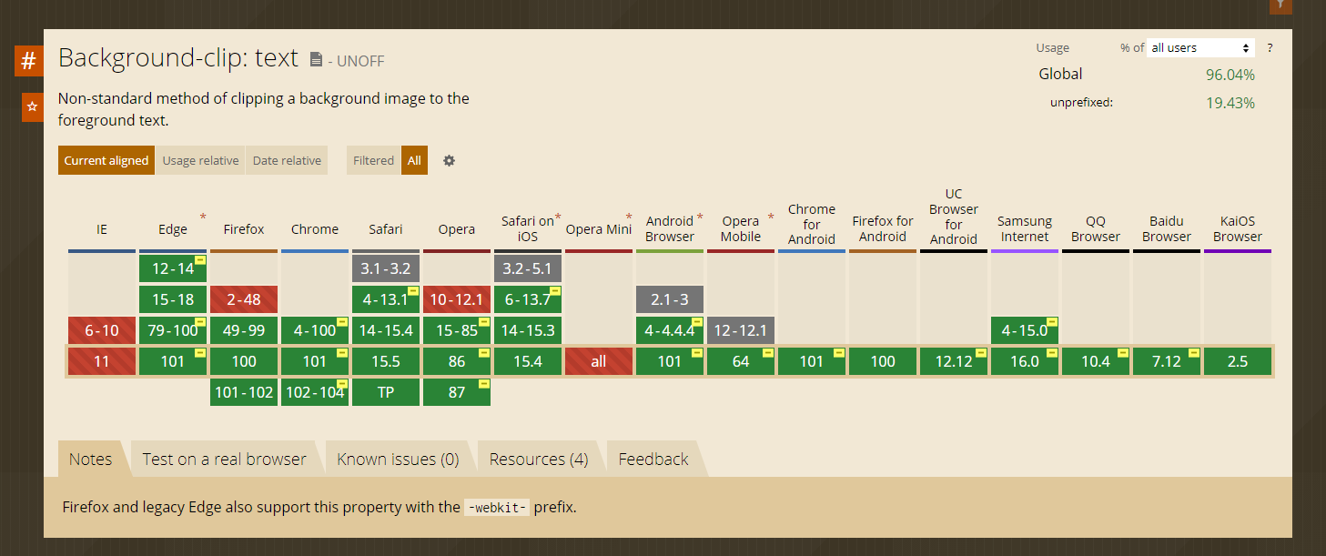
Support for this seems to be widely available so feel free to start using this on your designs.