
AurumUI - Designing a badge
Recently I decided to start building out a UI Web Component Library called Aurum UI. In today's post, I look at my design idea for a badge component
For this component, I have decided to split up the initial design idea into the following 5 characteristics.
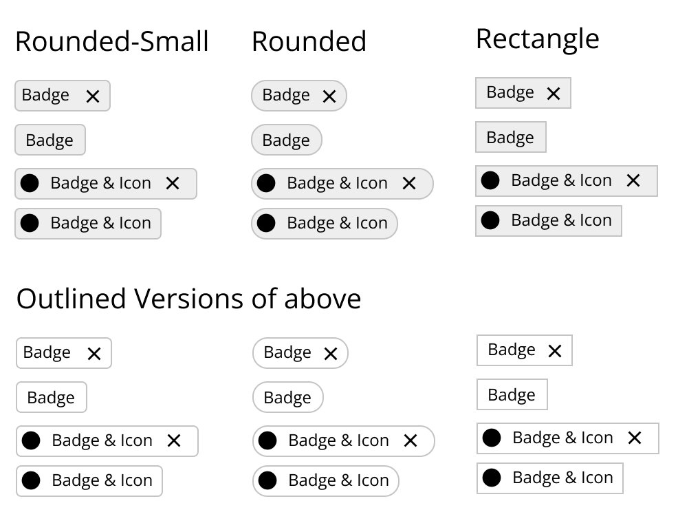
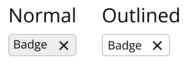
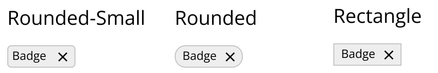
Design
The design is currently just focused on two types
Shape
Size
This will come in a few sizes which I have yet to determine in the grander library as a whole so will not be available straight away.
Selectable
If marked true, the button will have a hover state indicated by a shadow appearing on the hover and firing a click event.
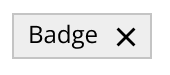
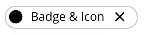
Closable
If marked true, the button will have an 'x' on the right-hand side, that when clicked will fire off an event that is separate from the selectable event.
I have decided to try and keep this design very simple including allowing the user to pass in an icon that will display on the left-hand side of the badge.
Do you think I am missing anything from this badge design? If so let me know in the comments section below.