
AurumUI - Designing the Accordion
Recently I decided to start building out a UI Web Component Library called Aurum UI. To get the project going I made its first component an accordion.
You can see below that the accordion is very simple, it is just one accordion on its own that can be opened.
The next stage of this component was to decide what I want the first version of the accordion to be functionality-wise and design-wise. I have split this into two sections taking into account that accordions can be single or part of a group.
Content
I have categorized this section to define what can be shown on an accordion and for our first version I have decided on 3 aspects that can contain content.
- The Accordions Header
- The Accordions SubHeader
- The Accordions Content
Design
In this section, I have defined a series of 4 different looks to the accordion which I think will give a great diversity in its original release.
Non-carded
This refers to a style where the accordion is not contained in anything except itself as below, this is in the same style as the one I first implemented at the top of the post but the design has now been more refined.
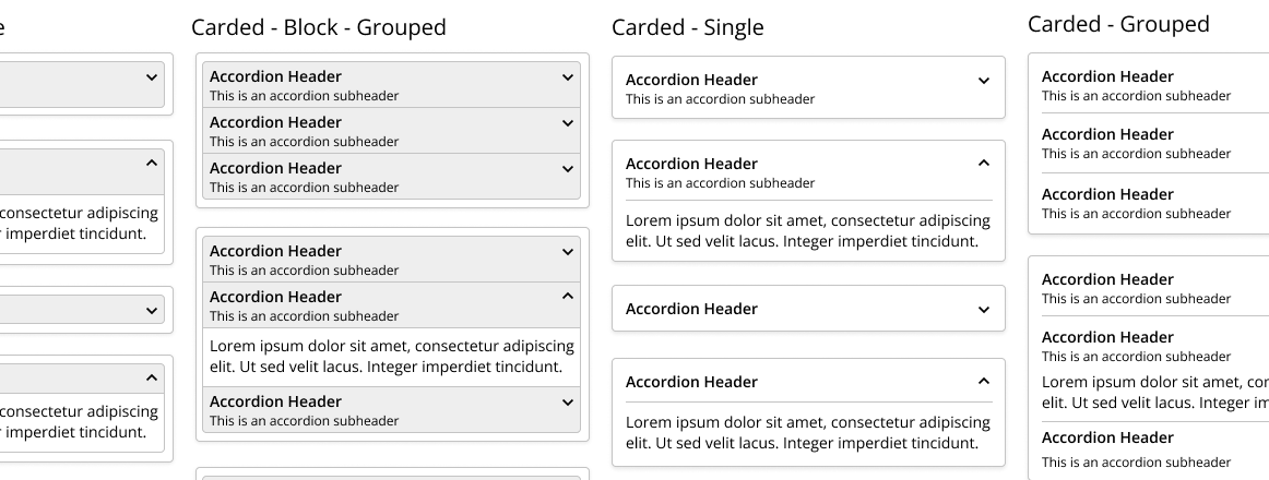
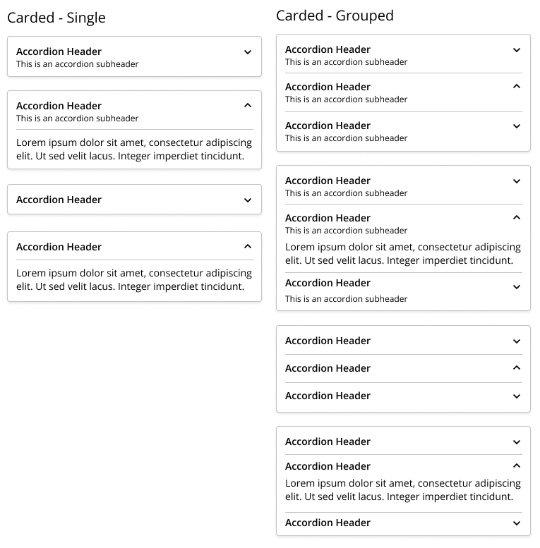
Carded
This is a design where the accordion has been contained within a card that has a shadow and the headers are no longer gray and makes use of padding.
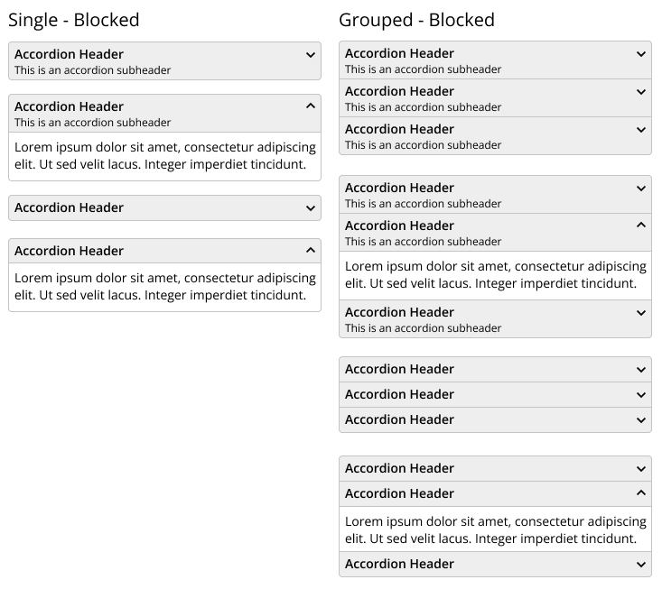
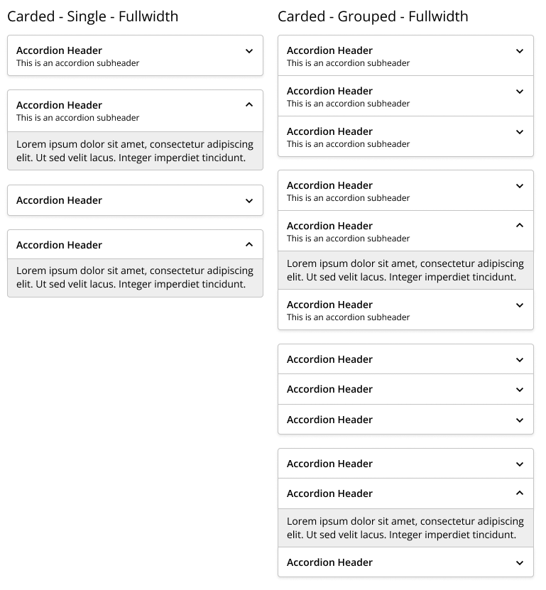
Carded - Full Width
This style builds on top of the style above, however, I have removed the padding, and the content section when it is opened has a background.
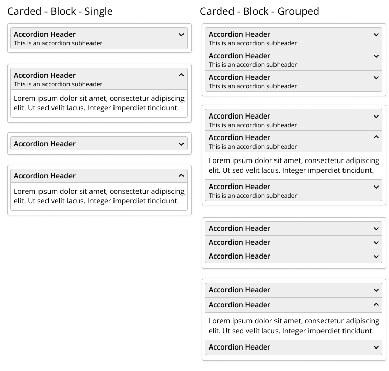
Carded Block
This final design for this first release is a combination of the first 2 designs. I have taken the non-carded design and placed it into a padded card.
Interactivity
Interactivity is the last thing I am looking at for the Accordion design, eg how does a user interact with the component? After a bit of research, I have decided to implement the Aria rules for accessibility as defined here https://www.w3.org/TR/wai-aria-practices/#accordion. I have decided also to not only do this for this component but for all the components in my UI library.
There is a lot of information in that link documenting keyboard shortcuts, Aria's role & states, etc, so much in fact I am planning on doing a blog post on Aria and my implementation of it on the accordion soon. So if you are not already please subscribe to the site and get notified when new posts go live.
In the meantime, I would love to know what you think of the designs above and what you would like to see from my Accordion by leaving a comment below.